Key Findings of the project
Freshly Harvested, 100% Original
Build on a solid concept, 100% Original
Versatile Design System
Unlimited Flavors, one packaging system
Holistic Brand & Product Design
Connecting real fruit flavor with tangible future-forward design, driven by digital and AI.
/01 Context
Fruttigo is a Colombian brand of 100% natural fruit pulp based in Cali. Its brand book defines a clear ideal customer: dynamic, multifaceted women who balance work, raising their children, and personal wellbeing, and who want fruit that is practical, healthy, and easy to enjoy in their routine.
Briefing
Research
Design & Production
The brief was to turn that positioning into a complete system: logo, brand book, packaging able to carry a full range of flavors, and the imagery and motion that bring it to life.
/02 Concept, Design & Technology.
Fresh by nature. Practical by design. One letter, one fruit.
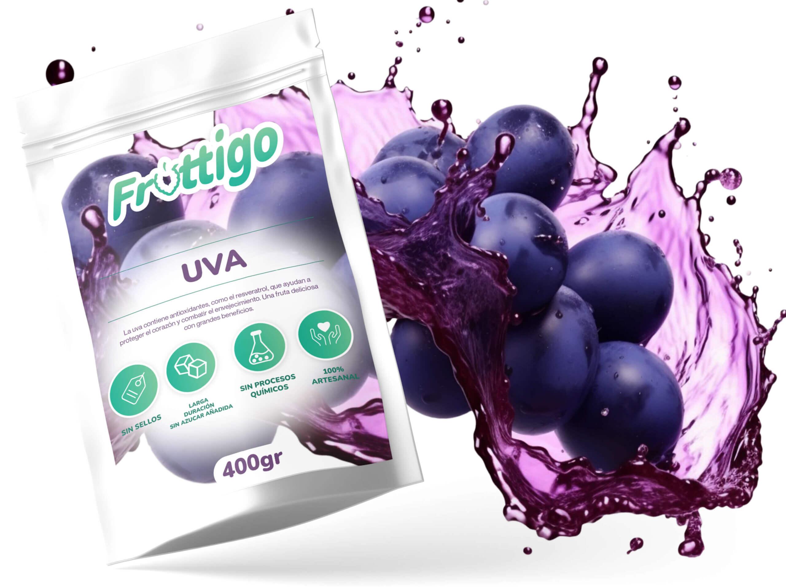
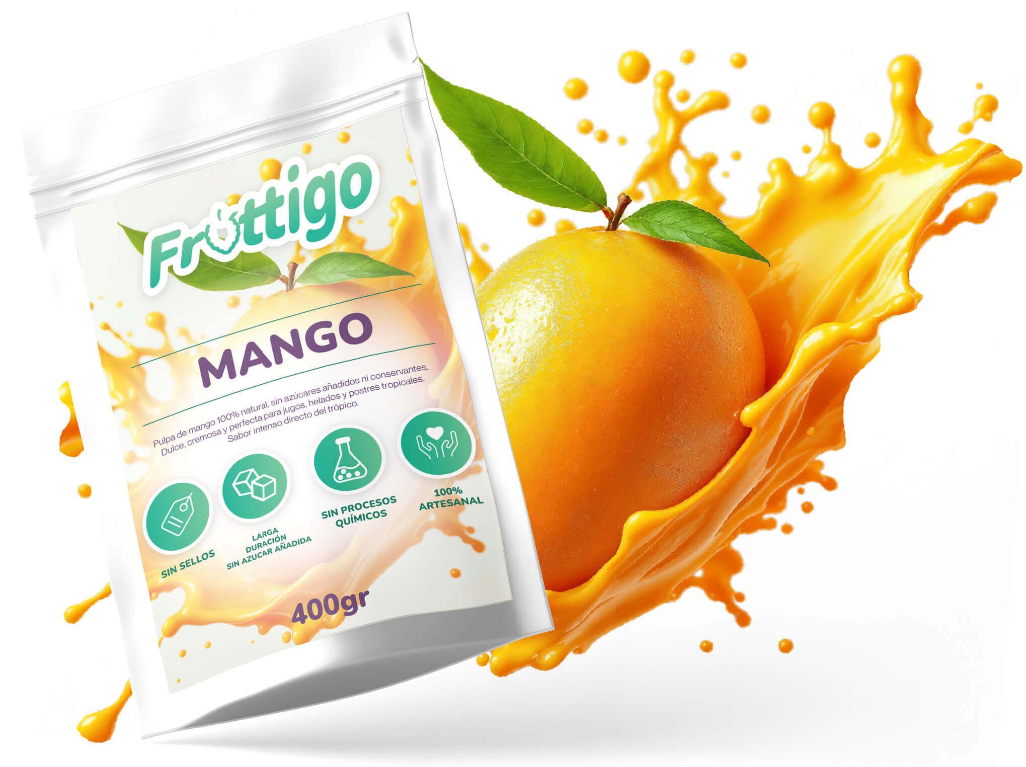
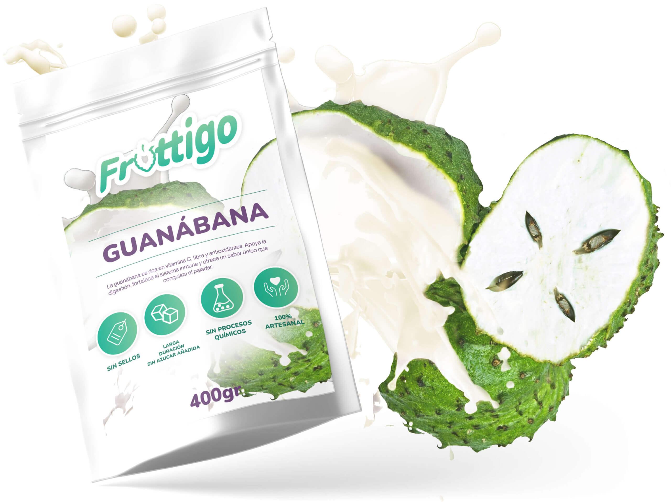
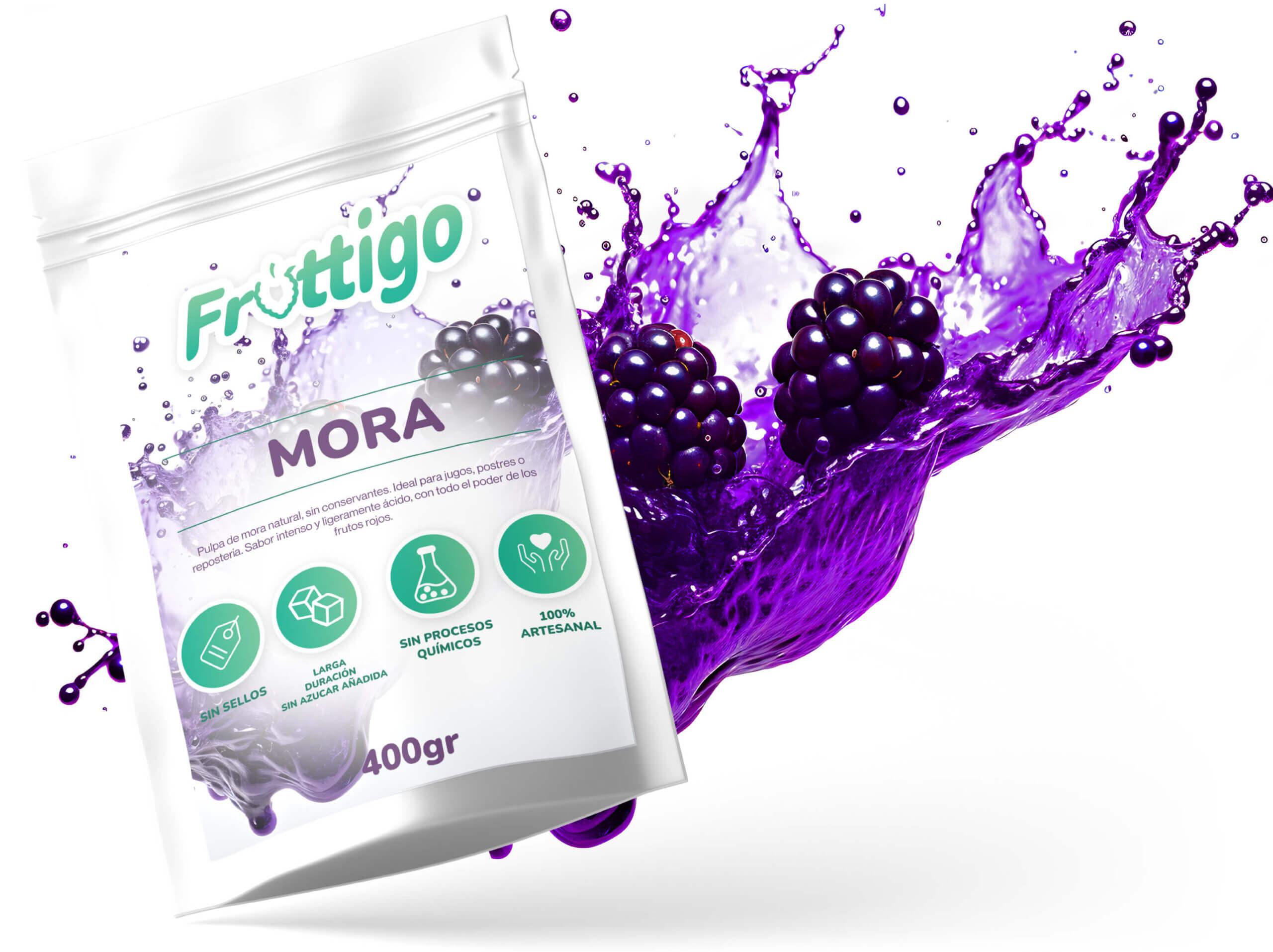
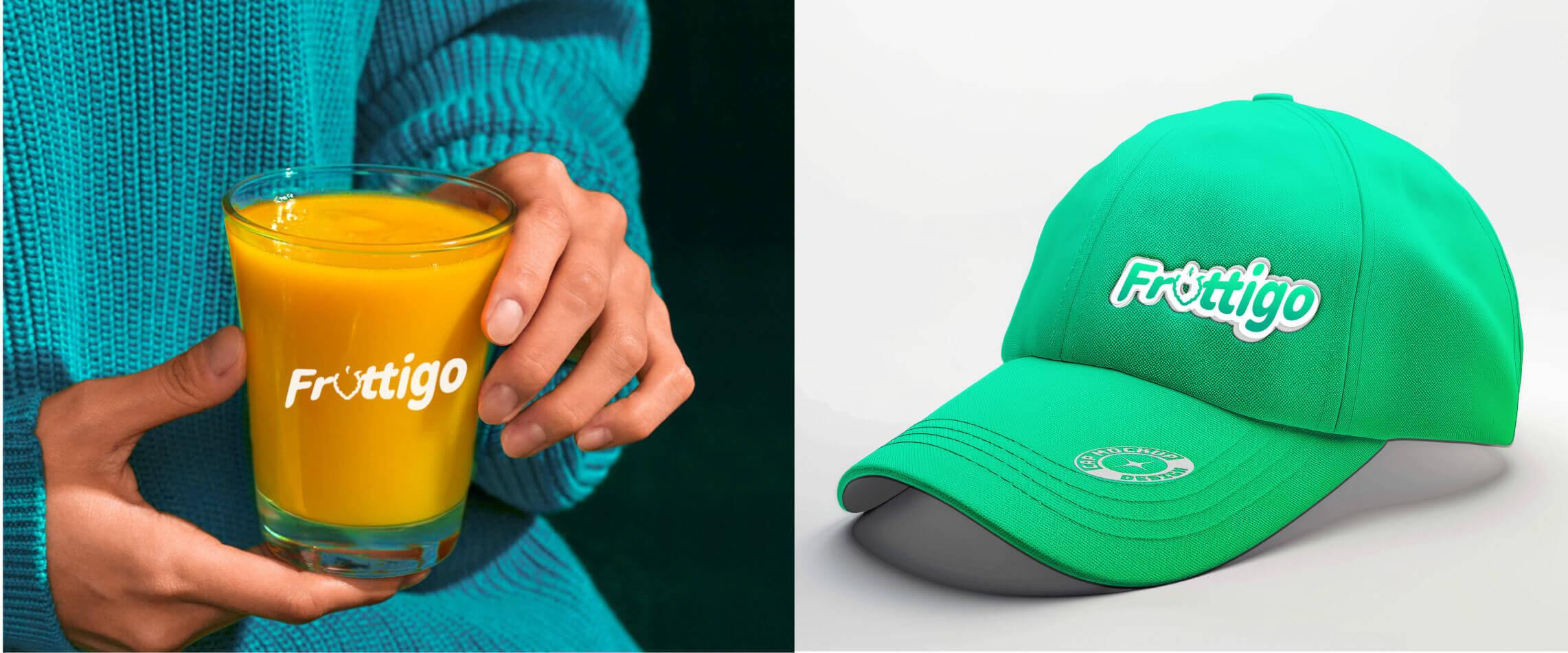
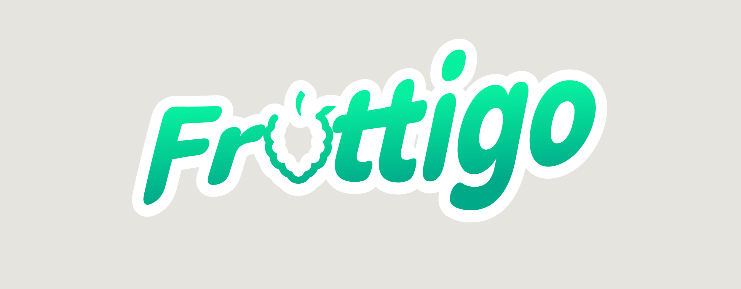
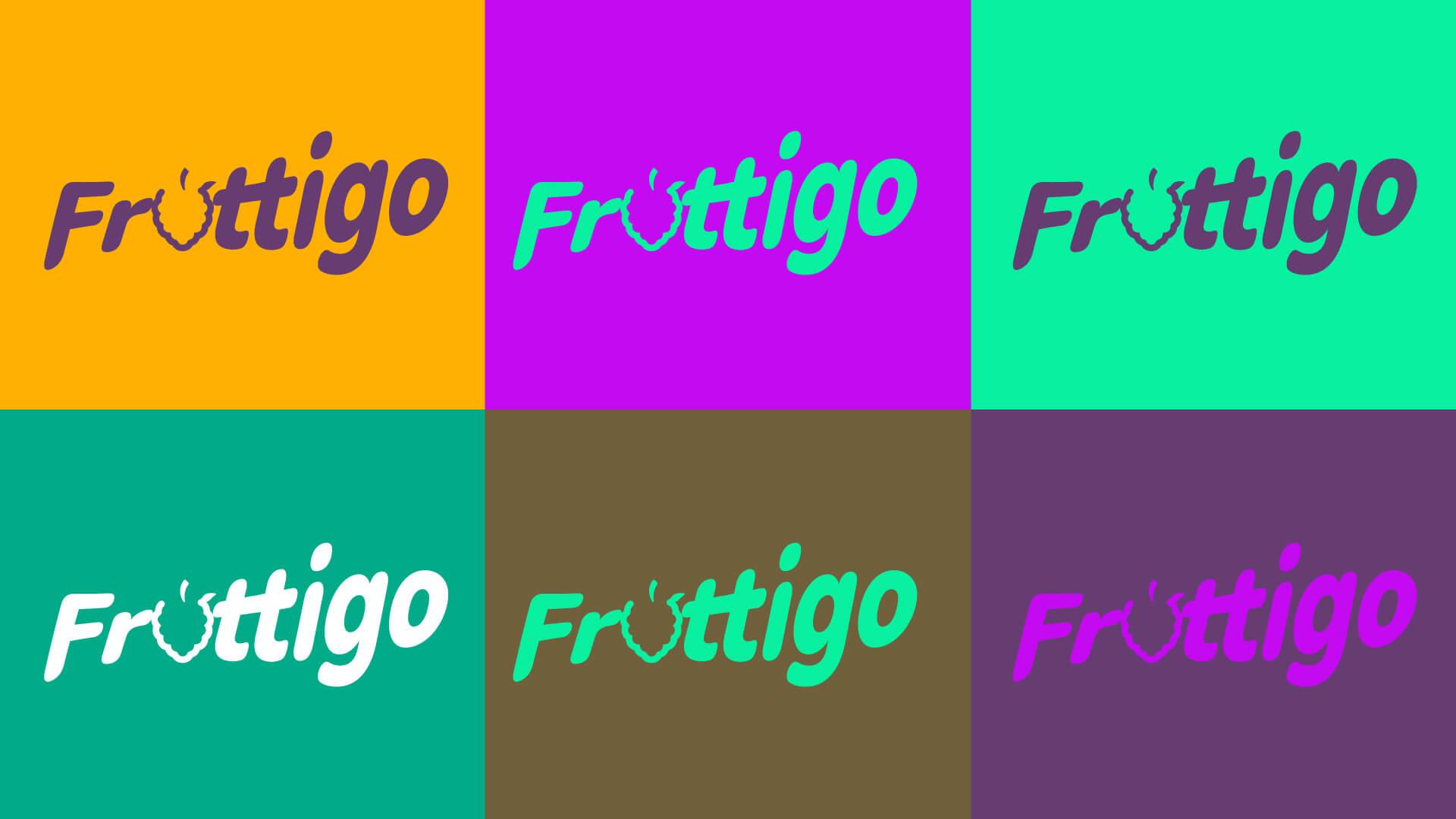
The brand promise comes down to three words: practical, healthy, and irresistible. The logo was designed from scratch, with no AI involved: rounded, flowing lettering in a mint-to-green gradient, with a white sticker outline that keeps it legible on any background. The letter “U” is replaced by a berry silhouette with a leaf on top, so the name itself carries the product.
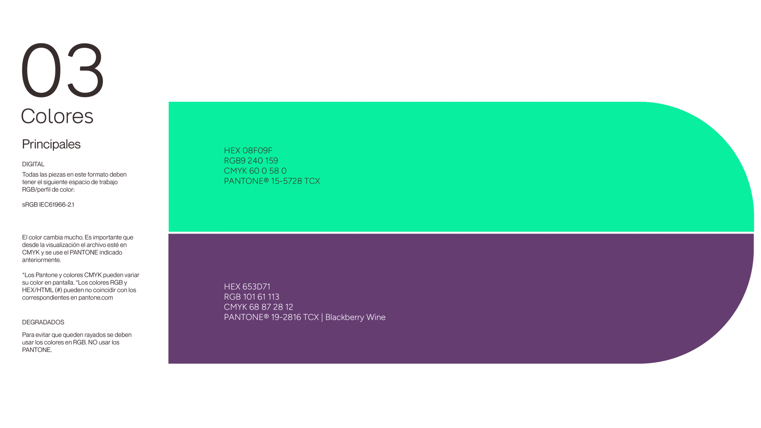
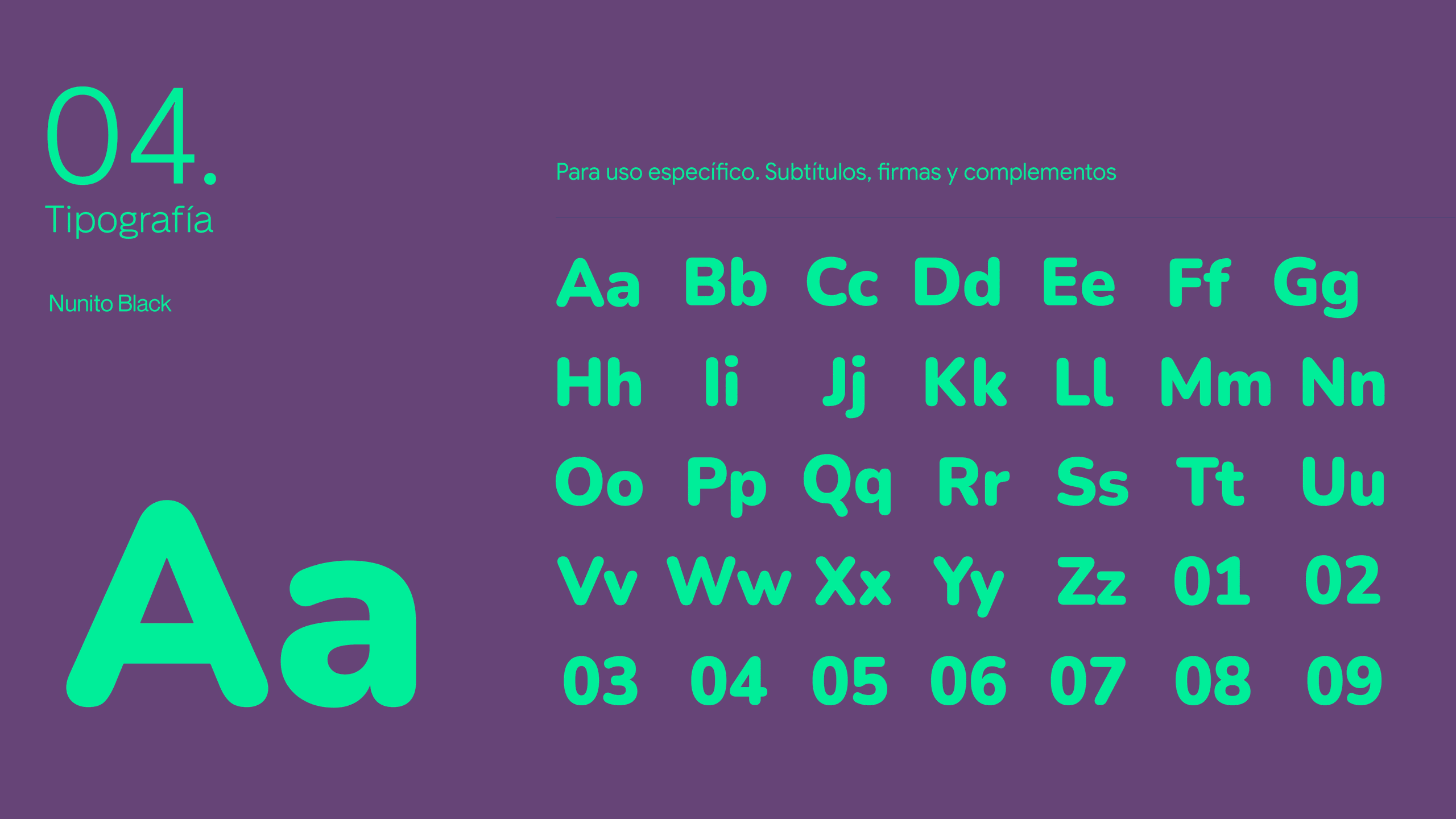
The color system is built on two anchors: mint green (#08F09F) as the primary, and Blackberry Wine (#653D71) as the secondary, used for flavor names and headings. Typography follows the same logic, with Neue Montreal for titles and body text, and Nunito Black for subtitles and signature elements. The brand book is organized into brand analysis, logo presentation, construction, colors, typography, and applications, so the team has one reference for every future piece.
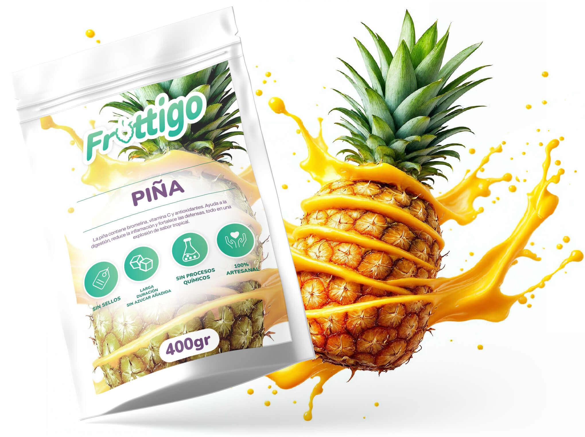
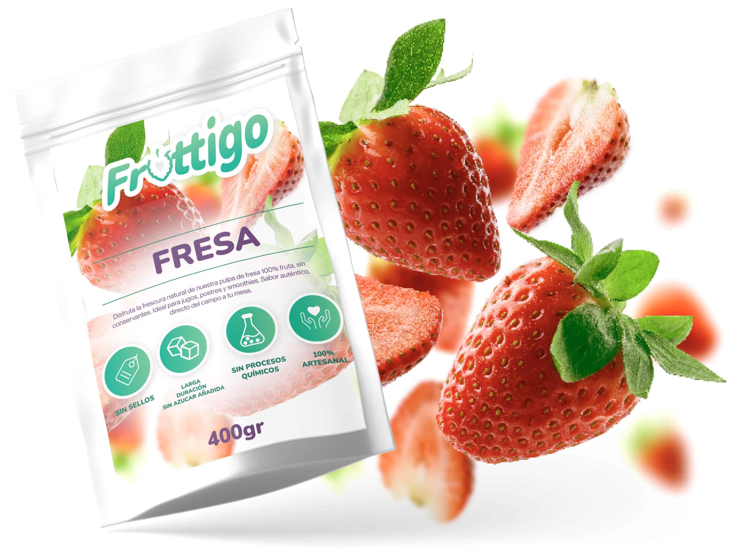
The packaging is a single system applied to eight flavors: strawberry, soursop, lulo, mango, passion fruit, blackberry, pineapple, and grape. Each 400 g pouch follows the same structure: the flavor name in Blackberry Wine between two thin green rules, a short descriptive text, and four green icons that communicate the brand’s promises (no warning seals, long shelf life with no added sugar, no chemical processes, and 100% artisanal). What changes is the color world: each flavor gets its own palette, with fruit suspended in liquid splashes, so the range reads as one family while every flavor stays instantly recognizable. Adding a flavor means a new image and a new name, not a new design.
The brand extends into stationery, ID badges, merchandise, and social content. The social pieces use a day-and-night concept (“Vitalidad en el día”, “Descanso en la noche”) that ties the product to everyday routines.
The fruit imagery was generated through AI-assisted workflows and retouched in Photoshop for realism and a consistent look. The first 3D animations and motion graphics, the fruit still lifes and splashes, were built in ComfyUI with Luma AI, and Adobe Firefly was used later for social media posts. The identity itself stayed human-made: AI was used where it multiplies production, not where it defines the brand.
/03 Feedback & Results
“TANGIBLE!!! 👏🏾 Today, while reviewing and organizing my gallery, I came across this great detail and wanted to share it with you all. I once started out afraid and full of doubts about my venture, and today it’s a reality. The progress is so tangible that even the packaging and the corporate identity look much better. Thank God, with Him everything is possible.” https://www.instagram.com/p/DSqhLBoEeFz/
— Founder, Fruttigo (Instagram)
From doubt to something tangible.
Fruttigo’s founder began her venture with fear and many doubts. Some time later, she shared a public post celebrating how far the brand had come, and singled out the packaging and corporate identity as part of that progress.
Build on a solid concept, 100% Original
Unlimited Flavors, one packaging system
Holistic Brand & Product Design
The project worked because the brand idea was simple enough to repeat everywhere and distinctive enough to own. A logo with a fruit built into its lettering gives Fruttigo something that is only theirs. A brand book and a packaging system with one structure and eight color worlds keep every touchpoint coherent as the range grows. And a clear line between a human-made identity and AI-assisted production let the brand grow its imagery and motion quickly without losing its authorship. For a young venture, that is what “tangible” looks like: a brand that finally looks like the business it has become.